


 Back to blogs
Feb 13, 2026
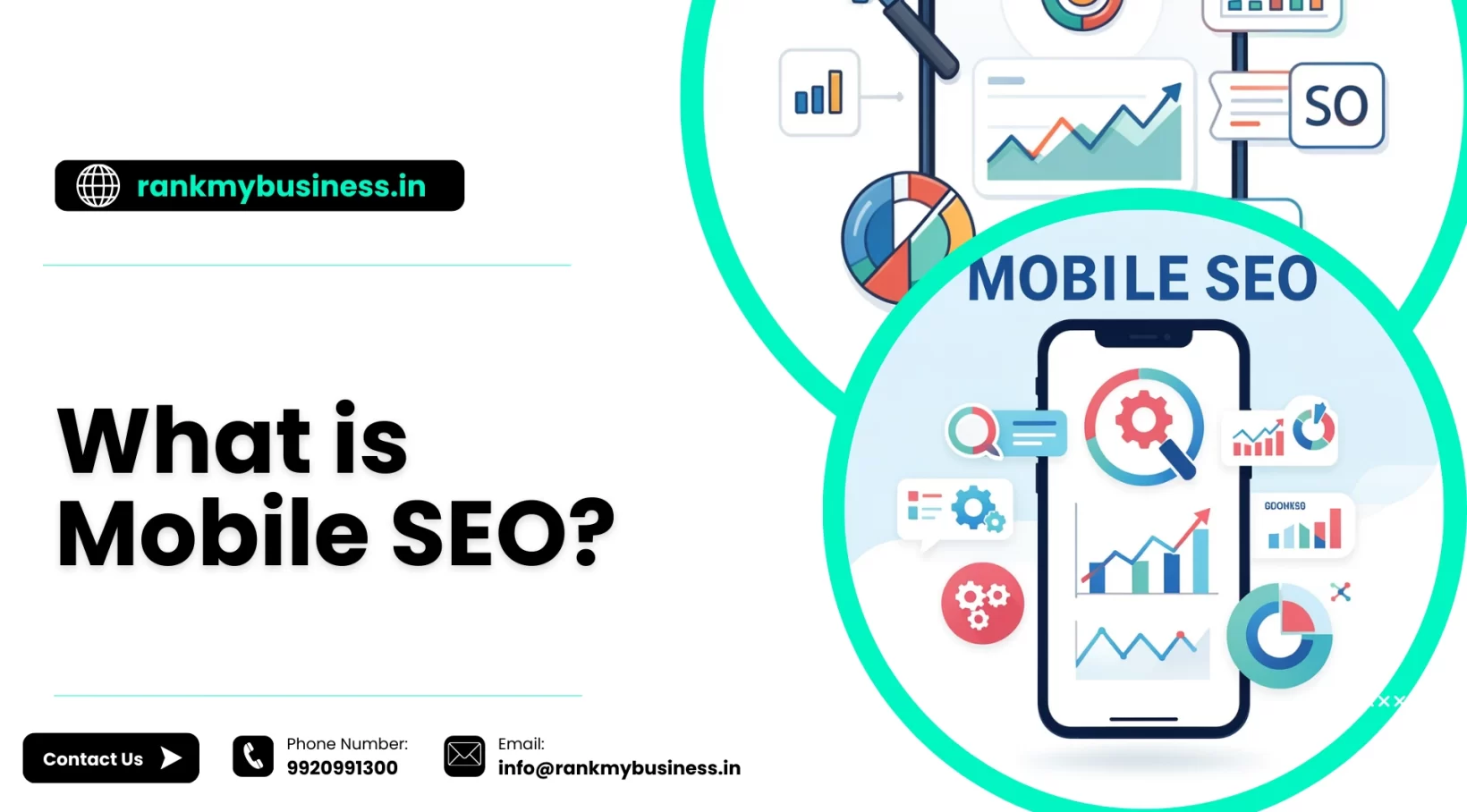
In today’s digital world, more people are browsing the internet on their smartphones than ever before. As mobile usage continues to grow, Mobile SEO has become a critical aspect of any website’s digital strategy. But what exactly is Mobile SEO, and why should you care about it?
In simple terms, Mobile SEO refers to the process of optimizing your website for mobile devices, like smartphones and tablets. The goal is to ensure that your website not only looks good but functions well and loads quickly on mobile screens, all while maintaining the same high-quality user experience found on desktop sites.
Let’s dive deeper into what Mobile SEO is, why it’s important, and how it impacts your rankings.
Understanding Mobile SEO
Mobile SEO is the practice of optimizing your website to ensure it provides an excellent user experience for people accessing it from smartphones and tablets. It goes beyond simply making your site viewable on smaller screens. Mobile SEO encompasses site design, structure, page speed, and technical considerations that affect how your site performs on mobile devices and how search engines evaluate and rank your mobile presence.
The distinction between desktop and mobile optimization became crucial when Google introduced mobile-first indexing. This means Google predominantly uses the mobile version of your website’s content for indexing and ranking. If your mobile site is lacking, your rankings across all devices suffer, even on desktop searches.
Why Mobile SEO Matters Now More Than Ever
The mobile revolution isn’t coming—it’s already here. People use their phones to search for everything from nearby restaurants to complex research topics. They shop, compare products, read reviews, and make purchasing decisions all from the palm of their hand. If your website doesn’t cater to this behavior, you’re leaving money on the table.
Google recognizes this shift in user behavior and has adjusted its algorithms accordingly. Mobile-friendliness is a confirmed ranking factor, and sites that don’t meet mobile standards face significant visibility challenges in search results. Beyond rankings, there’s the practical reality that a frustrated mobile user will simply leave your site and visit a competitor’s instead. High bounce rates from poor mobile experience send negative signals to search engines, creating a vicious cycle of declining performance.
Key Elements of Mobile SEO
Responsive Design
Responsive design is the foundation of mobile SEO. A responsive website automatically adjusts its layout, images, and functionality based on the screen size and device being used. Instead of creating separate versions of your site for different devices, responsive design uses flexible grids and CSS media queries to create one site that works everywhere.
This approach not only provides a consistent user experience but also simplifies your SEO efforts. You maintain one set of content and one URL structure, making it easier for search engines to crawl and index your site. Google explicitly recommends responsive design as the preferred mobile configuration.
Page Speed on Mobile
Mobile users are often on cellular connections that are slower than home Wi-Fi, making page speed even more critical for mobile SEO. Every second of load time matters. Studies show that 53% of mobile users abandon sites that take longer than three seconds to load.
Optimizing for mobile speed requires compressing images, minimizing code, leveraging browser caching, and reducing server response time. Google’s PageSpeed Insights tool can help identify specific issues slowing down your mobile site and provide recommendations for improvement.
Mobile-Friendly Navigation
Navigation that works well on desktop can be clunky and frustrating on mobile. Mobile SEO requires rethinking your site’s navigation to accommodate touch controls and smaller screens. Menus should be easily accessible, buttons should be large enough to tap without accidentally hitting adjacent elements, and critical information should be readily available without excessive scrolling or zooming.
Consider implementing a hamburger menu for complex navigation structures, use clear and descriptive anchor text, and ensure forms are simple and easy to complete on a small touchscreen. The goal is to make it effortless for mobile users to find what they’re looking for and take desired actions.
Avoid Intrusive Interstitials
Pop-ups and interstitials that cover the main content can be annoying on desktop, but they’re particularly problematic on mobile devices where screen real estate is limited. Google penalizes sites that use intrusive interstitials that make content less accessible on mobile devices.
If you need to use pop-ups for newsletter signups or other purposes, ensure they’re easy to dismiss, don’t cover the majority of the screen, and appear at appropriate times rather than immediately upon page load. Better yet, integrate these elements into your page design in a way that doesn’t disrupt the user experience.
Local SEO Optimization
Mobile searches have strong local intent. People searching on mobile devices are often looking for nearby businesses, services, or information relevant to their current location. Optimizing for local SEO is therefore a crucial component of mobile SEO.
Ensure your Google Business Profile is claimed and fully optimized, include location-specific keywords naturally in your content, and make sure your name, address, and phone number are consistent across all online platforms. Mobile users frequently use “near me” searches, so appearing in local results can drive significant qualified traffic to your business.
Thumb-Friendly Design
Mobile users navigate primarily with their thumbs, and your design should accommodate this. Important buttons and calls-to-action should be placed within easy reach of the thumb, typically in the bottom half or center of the screen. Avoid placing critical elements in the top corners where they’re harder to reach on larger phones.
Buttons and clickable elements should be at least 48×48 pixels to prevent mis-taps. Provide adequate spacing between interactive elements so users don’t accidentally click the wrong thing. This attention to ergonomic detail improves user experience and conversion rates.
Structured Data and Schema Markup
Structured data helps search engines understand your content and can enable rich results in mobile search. Rich results like star ratings, FAQs, how-to guides, and event information stand out in mobile search results and can significantly improve click-through rates.
Implementing schema markup for your business type, products, reviews, and other relevant information makes your mobile search listings more informative and attractive. This is particularly valuable on mobile where screen space is limited and standing out in search results is crucial.
Testing Your Mobile SEO
Google provides several tools to help you evaluate and improve your mobile SEO. The Mobile-Friendly Test shows how easily visitors can use your page on a mobile device and identifies specific issues. Google Search Console’s Mobile Usability report flags pages with mobile usability problems that could affect your rankings.
PageSpeed Insights analyzes both mobile and desktop performance, providing specific recommendations for improvement. Regularly testing your site with these tools helps you identify and fix issues before they significantly impact your traffic and rankings.
Don’t rely solely on automated tools. Actually use your website on various mobile devices to experience what your users experience. Browse different pages, fill out forms, and navigate through your site. This hands-on testing often reveals usability issues that automated tools miss.
Common Mobile SEO Mistakes to Avoid
One frequent mistake is using Flash, which doesn’t work on many mobile devices and is no longer supported by modern browsers. Another is having text that’s too small to read without zooming or elements too close together to tap accurately. Both create frustration and drive users away.
Blocking CSS, JavaScript, or images from crawlers can prevent Google from properly rendering and evaluating your mobile site. Ensure your robots.txt file doesn’t inadvertently block resources that search engines need to understand your mobile experience.
Using separate mobile URLs (like m.yoursite.com) instead of responsive design creates additional complexity and potential for errors. If you must use separate mobile URLs, proper configuration and rel=canonical tags are essential to avoid duplicate content issues.
The Future of Mobile SEO
Mobile SEO continues to evolve as technology and user behavior change. Voice search is increasingly common on mobile devices, requiring optimization for conversational queries and featured snippets. Progressive Web Apps (PWAs) are blurring the line between websites and native apps, offering app-like experiences through mobile browsers.
Page experience signals, including Core Web Vitals, have become more important in rankings. Google’s focus on user experience metrics means mobile optimization must go beyond basic functionality to deliver genuinely excellent experiences. At Rank My Business, we stay ahead of these trends to ensure our clients’ websites remain competitive in an increasingly mobile-first world.
Conclusion
Mobile optimization isn’t optional anymore—it’s fundamental to your online presence. Start by testing your current mobile performance using Google’s tools. Identify your biggest issues and prioritize fixes based on impact. Focus first on ensuring your site is responsive, loads quickly, and provides easy navigation.
Remember that mobile SEO is an ongoing process, not a one-time fix. As devices, user expectations, and search algorithms evolve, so must your mobile optimization strategy. Whether you’re handling optimization yourself or working with professional SEO services in Melbourne or beyond, the key is maintaining a consistent focus on mobile excellence.
By committing to excellent mobile experiences, you’re not just improving your search rankings—you’re building a foundation for long-term digital success. At Rank My Business, we can help guide you through the process of mobile optimization, ensuring that your website is always performing at its best for mobile users. Contact us today to enhance your mobile SEO strategy!
Recent Posts
by rmb_admin
post
Is AI Replacing SEO? Understanding the Shift to AI SEO
Feb 23, 2026
by rmb_admin
post
What Is PPC and Why Does It Matter?
Feb 23, 2026
by rmb_admin
post
SEO or PPC: Where Should You Invest Your Marketing Budget?
Feb 20, 2026
by rmb_admin
post
On-Page vs Off-Page SEO: What Matters More?
Feb 20, 2026
by rmb_admin
post
7 SEO Tips for Ecommerce Businesses in India
Feb 17, 2026
by rmb_admin
post
What is Local SEO and Why Does It Matter for Your Business?
Feb 17, 2026
by rmb_admin
post
What is Mobile SEO?
Feb 13, 2026
by rmb_admin
post
What is On-Page SEO and How Does It Impact Your Rankings?
Feb 13, 2026
by rmb_admin
post
What is Off-Page SEO and Why Is It Important?
Feb 12, 2026